Small retail spaces are the preferred choice for pop-up retailers as they don’t require a huge fit out. However, making the most out of a small space can be tricky, from having enough space for your products to hosting events inside. But by thinking creatively, you can create some truly unique experiences for your customers. We spoke to some of the top retail design agencies in London to find out how they tackled the challenge of small spaces. Here’s what Marmalade London, Not Tom and Kennedy Woods had to say:

The Rapha store by Kennedy Woods
Do one thing well
First things first, you need to ask yourself, why are you doing this? Whether the aim of your pop-up is to drive sales, raise awareness for your brand or raise your profile on social media, you need to make sure your fit out is focussed on the main aim. Not Tom advised, “You might want your space to fulfil multiple functions but try to write down the most important one and design your scheme around that. In a small space, it’s better to do one thing really well.”
Keep it simple
Sometimes less is more, as Not Tom pointed out, “don’t be scared to really pare it down. It’s easy to be distracted by showy details, but it’s important to focus on a few key pieces. If you have too much going on visually, it can be distracting and confusing for visitors, especially in a small space. Keeping things simple generally looks more tasteful and also creates more impact.”

Run and Fell by Not Tom
Lift things off the floor
Don’t get hung up on how much floor space you have. Think about how you can maximise the height too. Marmalade London highlighted this fact, “when you enter a space your eyes run very quickly across the floor. As a result, if you are able to see the edges of a floor this can make a room feel more open. Where possible use floating shelves or hang rails from beams in the ceiling. This ensures all your products are on display, but makes the room feel as airy as possible.

Sophie Hulme's Fashion Week Space by Marmalade London
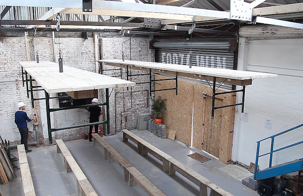
Kennedy Woods also used this trick to maximise the space in Forza Win’s pop-up restaurant. Forza Win approached them with a problem: they were hosting 60 guests for dinner in one sitting, but when the meal was finished people wanted to dance and the furniture was stopping them continuing the party into the night. Kennedy Woods designed a special rig in their space that allowed them to winch the tables into the air after dinner was done. The result: You could dance on or under the tables depending on the mood of the evening. Watch how it was made here.

The winch tables at Forza Win by Kennedy Woods
Make it work with mirrors
This is a favourite trick of interior and retail designers alike. As Marmalade London suggested, “mirrors will instantly open up a space and also give you an opportunity to play with perspective, bounce light, or even use several layers of mirrors to make the tiniest corridor feel like a kaleidoscope.” But note, if your budget can accommodate always use glass mirrors rather than acrylic (especially if you’re a fashion brand). Marmalade London also pointed out there are now some amazing stretched mirrors on the market, which can help solve this problem.

Spark Your City by Marmalade London
Embrace the dark side
Although painting a small space white can help to brighten and open it up, Marmalade London pointed out, “a palette of warmer darker colours can sometimes help to push the walls out and make the most of a space. Use colours that sit well together, warming the space, using one or two brighter pops of colour to make sure the eyes are drawn to focal points.”

The Finery London fitting rooms by Marmalade London
Keep in character
Make sure you play with the character of the space. When Kennedy Woods were challenged with designing a fit out for the Good & Proper Tea Kiosk in Old Street – they had just 6m x 2.5m and low ceilings to play with. They explained, “rather than subdividing this into several cramped areas for serving, seating and retail, as originally intended, we designed at dual-level counter running the entire width of the shop, linear shelving behind, and a long bench out front: All of which served to exaggerate the length of the space and take attention away from the lack of depth.

The Good and Proper Tea Kiosk by Kennedy Woods
For more retail design tips, take a look at:
How to create a succesful retail experience
How to fit out a shop on a small budget
How to design a pop-up shop