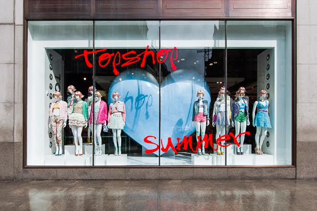
How do you make your shop stand out on the street? Well, it all starts with curating a great window display. Your windows are essentially a blank canvas to not only exhibit the best of what’s in-store, but to get creative and allow your brand personality to shine through. It’s your first opportunity to catch the attention of the passersby and entice them into your shop. As this is a vital marketing space, it’s crucial you not only get it right, but you utilise it to its full potential.
To help you master a killer window display, we caught up with Sian Roberts, the Head of Creative at Topshop, who shared with us her top tips and advice. Here are the six key components for making a shop window stand out.
1. Tell a story

Successful window fronts often tell a story. Following a theme or coinciding with a national holiday or season, for example, making a festive display during December to correspond with Christmas is always a good foundation for a display. “We always start with looking at trends,” Sian explained, “both forthcoming fashion trends for the business and what's on the catwalk. We also do a lot of research into interior design trends.” This being said, try not to be predictable with your ideas. Try to think outside of the box- disrupt, be innovative, be whimsical and surprise those passing by with something they haven’t encountered before. For inspiration, “the internet is a wonderful thing, Pinterest, instagram and websites like WGSN/Cool Hunter/Stylus are great,” suggested Sian, “we brainstorm as a team a lot - it’s our favourite part of the job!”
2. See the light

People often don’t realise how effective lighting can be in a window display so get ahead of the game and experiment. Lighting is so vital in fact, that Sian went as far as saying that “it can make or break a window scheme.” Spotlights are a great way to focus attention on key pieces of the display. Use different angles, colours and experiment with how the light can lead a person’s eyes to a product. By incorporating light, your shop window may be the beacon of visibility amidst the duller shop windows on the same street. This being said, “it’s important for it to be a supporting function in the window and not dominate the window and impact the window scheme.”
3. Get creative

Layer, layer, layer. Don’t be 2-dimensional with your ideas because people love to discover and uncover things. Add different heights and multiple layers with vinyls and materials, stands and suspensions so customers eyes can gaze over your window for more than a couple of seconds. During the planning stages of design at Topshop, “it’s back to the brainstorm process – we update the look of our stores every season and so pull together loads of mood boards based on our inspirational trips.” It is always a good idea to choose a focal point for your display which will ideally sit at eye level and the point at which you can build the rest of your display around. On that note, windows aren’t often at street level meaning you will need to go outside of your shop and see for yourself whereabouts your customer's eye level will be. If you plan on suspending objects from the ceiling or elevating objects from the floor, try to get them to still reach eye level to ensure they are noticed.
4. Be bold as brass

Don’t create a timid display, be bold and inventive. This is your chance to be eccentric, flamboyant, grandiose and vibrant. Using large objects or striking props and a bright colour palette can help to do this. “I believe we should inspire and excite,” Sian commented, “It’s also about being brave and taking chances,” There is a fine line between ‘wow’ and ‘over the top,’ so try to still maintain a sense of simplicity. If this isn’t quite your brand’s style then you can still catch people’s attention – use a monochrome colour scheme, have elegant vintage props or be minimalistic adding emphasis on just one or two key products in your window.
5. Keep it clean

Don’t let your window look like Grandma’s bric-a-brac cupboard. Too many items in a window space can be overwhelming to those looking in and will deter people coming in for fear your shop's interior will look more like a box of tat rather than a chic retail space. Also, ensure your window is clean because you don’t want to spend time fitting the window space out only for dirt to cover it. Make sure the street space outside of your window is regularly swept too- cigarettes butts, beer cans and next doors shopping bags will only look scruffy. “Standards are key; a well designed, styled and dressed window are the eyes to your store- bad implementation is soul destroying.”
6. Shake it up

Always rotate and change your display. Shopping trends are synonymous with social trends so you need to make sure you stay relevant. “In our Oxford Circus store we look to update the window scheme as often as every 3 weeks,” said Sian, “although around Global launches they occur more regularly. We update the styling in our windows weekly, although again the teams are very reactive to weather/trends so this can and does happen more often at times.” However, for smaller brands with a low budget or a short residency in their space, at least every two months should be sufficient to keep your space fresh.
So now you know the secrets from one of the most influential fashion stores in the world, there are no excuses for not making your window space the best on the street.
Related Articles