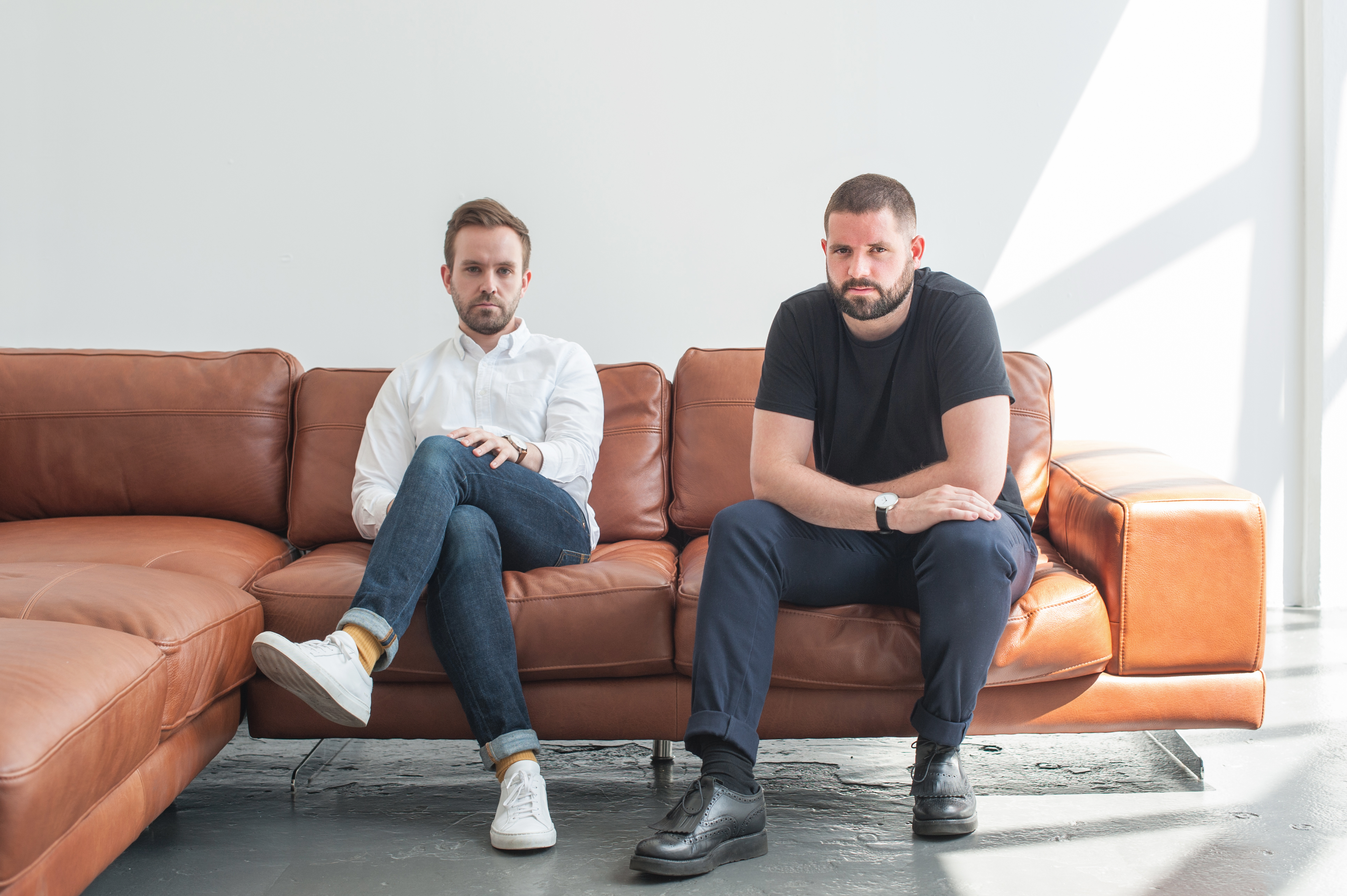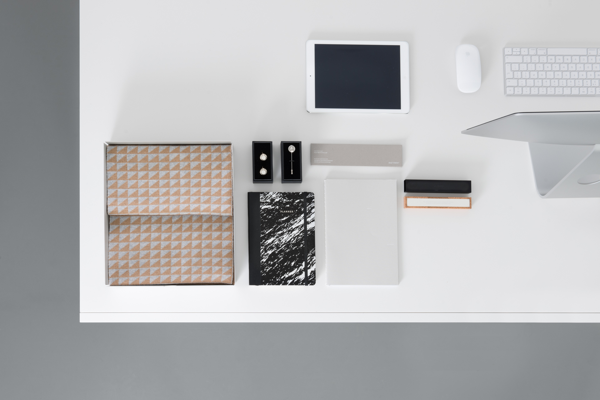
“Glasgow's one of those cities where, although it's not a huge place, there's a really interested market, so if you do something good, people will talk about it,” explains Ross Baynham, one half of design duo Instrmnt. The brand began life as a Kickstarter campaign to launch a beautifully simple Swiss watch. Alongside his business partner, Pete Sunderland, they’ve seen Instrmnt grow into a thriving business. So much so that earlier this year the pair opened an Instrmnt store in Glasgow’s city centre. Staying true to the design principles of the brand itself, the space is clean, meticulously ordered and champions the minimalist approach of the designers.

Transitioning from being designers to retailers isn’t always the most obvious route and for Instrmnt there’s still a little fog surrounding how they define themselves. “We're not too precious about stating what we are,” says Sunderland. Baynham agrees, “some people see us as a store because they interact with our shop in Glasgow more than anything, and then some people see us as a watch company because we're probably best known for our watches.” The ambiguity doesn’t seem to bother them a great deal; in fact they appear to almost relish the challenge of fulfilling multiple roles. “These days you have to do more than just 'create a brand,' you need to be more than one thing,” says Baynham.
Establishing a physical presence in Glasgow has proven to be a wise move for the duo, however setting up a store wasn’t always on the cards. “The idea initially was that it would be a studio shop, and so we'd work in it but also sell the product in it,” says Baynham, “But for logistical reasons, like just how much stuff you have surrounding you in a day-to-day working environment, we'd thought it might be a bit messy, and that's really not in line with the brand, so we decided to just have it as a store.”

Although both designers are experts in creating products that aligned with their design principles, developing a space that met the same criteria required a slightly different approach. “[Creating a retail space] is a different challenge and it's something we really wanted to do,” says Baynham. “We take a lot of inspiration from things like interiors and architecture, and it’s nice to work on that scale after having worked on a product scale for so long.”
In many ways, having the opportunity to work on a different medium, a world away from watch-face design and strap buckles, proved to be quite refreshing. “The thing is with the product you have a certain cut off where it's finished and it’s ready to go out into the world, but with the store it's always kind of evolving and changing. So it's never finished, there's always stuff to be done,” says Sunderland.
The pair have very much embraced the evolving, fluid nature of today’s retail stores, and like any modern shop worth its salt, they plan to use the space for far more than simply showcasing their wares. “Every month we try to do events in the store as well, like sample sales, or book talks,” explains Sunderland. “Just so that this place isn't just a shop, it has more of a community vibe as well.”

With ever-growing numbers of customers flocking to the convenience and choice offered by digital retail, today’s physical stores need to provide something the internet can’t: a fact that Instrmnt are well aware of, “If you're just a shop now, it's hard,” say Sunderland. “A store has to be part of the community, where you can go to whenever, and you can see different sides of how the company works.” This approach, of using the space to not only showcase product, but to display your entire brand ethos doesn’t just make marketing sense, it also makes financial sense, “as you're paying to have a store, you might as well open at night sometimes, and try and increase your visibility and the amount of time customers can spend in the space,” says Baynham.
As important as it is to colour outside the traditional retail lines, the duo recognise that it’s still crucial that their space functions as a shop. They need to ensure customers want to come inside, look and learn about products and then, hopefully, buy something. Striking that balance between a space that adequately represents the brand but also functions successfully as a store was a challenge. As Sunderland says, “One of the hardest things for us in a retail environment is balancing product with the space, because obviously you don't want it to look too crowded. It's about having just enough on show.”

That said, the pair are wary not to tip the scale too far in the opposite direction and create a store that’s so stripped down it would be in danger of putting off would-be shoppers. “With a super slick, minimal website and product, customers can kind of browse and look and enjoy it, but if your store seems too minimal and cold, it can sometimes be a bit off-putting,” explains Baynham. “The customer still has to open the door and walk in, and I think you need to get that balance of making somewhere welcoming but still keeping it on brand when you're minimalists.”
Despite both only being in their mid-twenties and first-time retailers, it’s impressive that the designers behind Instrmnt understand that creating something notable in retail is a balancing act. One that demands you keep the plates of innovation, brand communication and functional retail all spinning simultaneously. Their approach to ensuring their store is successful is actually quite simple. As Ross Baynham says, “it’s just about giving people a reason to make the trip down to the shop.”

Words by Joe Iley | Twitter @joeiley